Te Au The Current
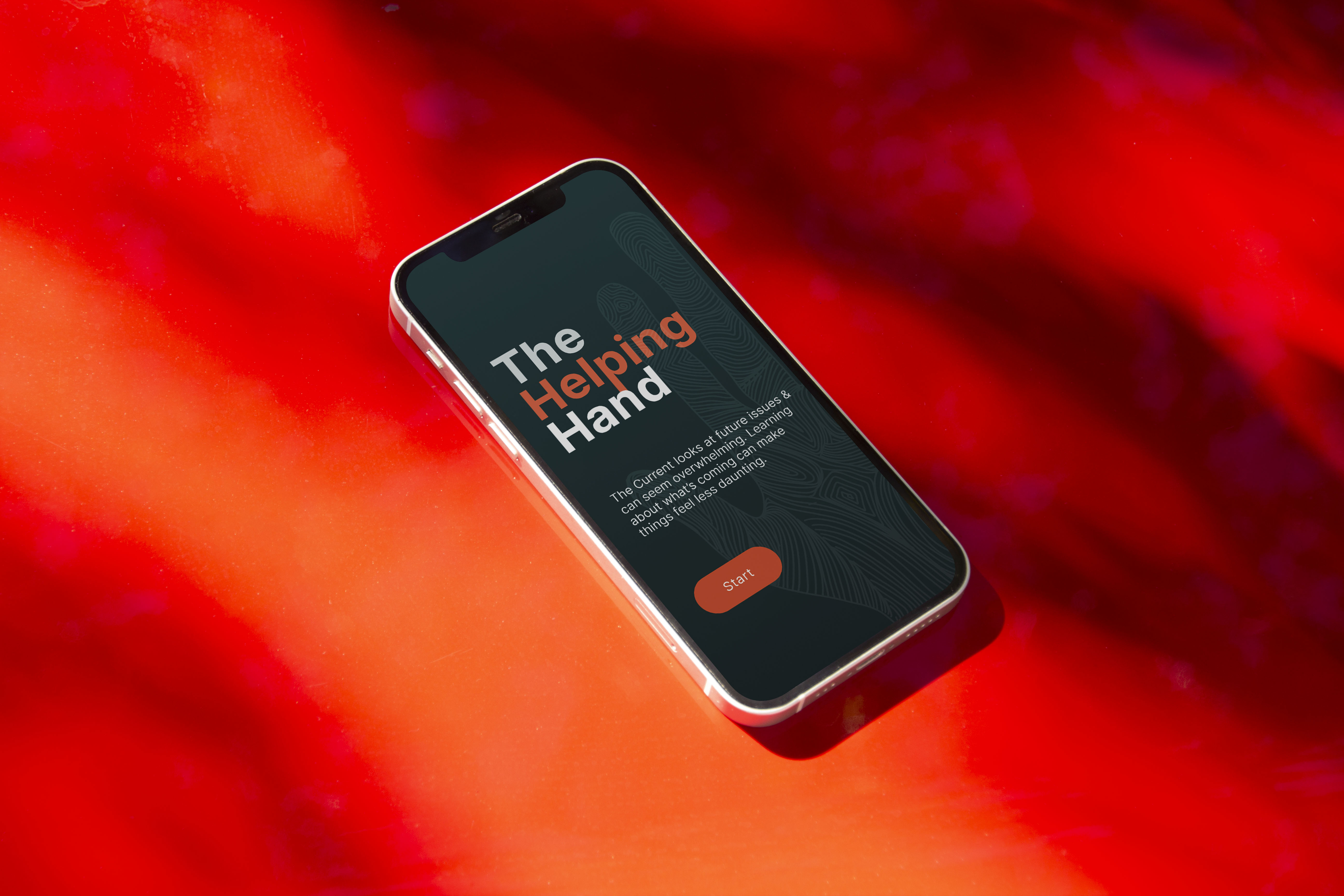
An interactive data visualisation and educational experience created as an extension of The Current, Te Papa’s live visitor survey installation. While analysing survey responses, I noticed a clear pattern: visitors felt overwhelmingly worried, uncertain, and pessimistic about the future across environmental, social, and political issues. The goal was not to persuade, but to reduce fear through clarity.
Role and focus
UX design across research, data analysis, information architecture, interaction design, high-fidelity UI, and prototyping.
Problem and audience
Museum visitors were engaging with complex global issues emotionally rather than informatively. These users are curious but time-poor, often overwhelmed by headlines, and need calm, accessible explanations that help them make sense of difficult topics without feeling talked down to.
Approach
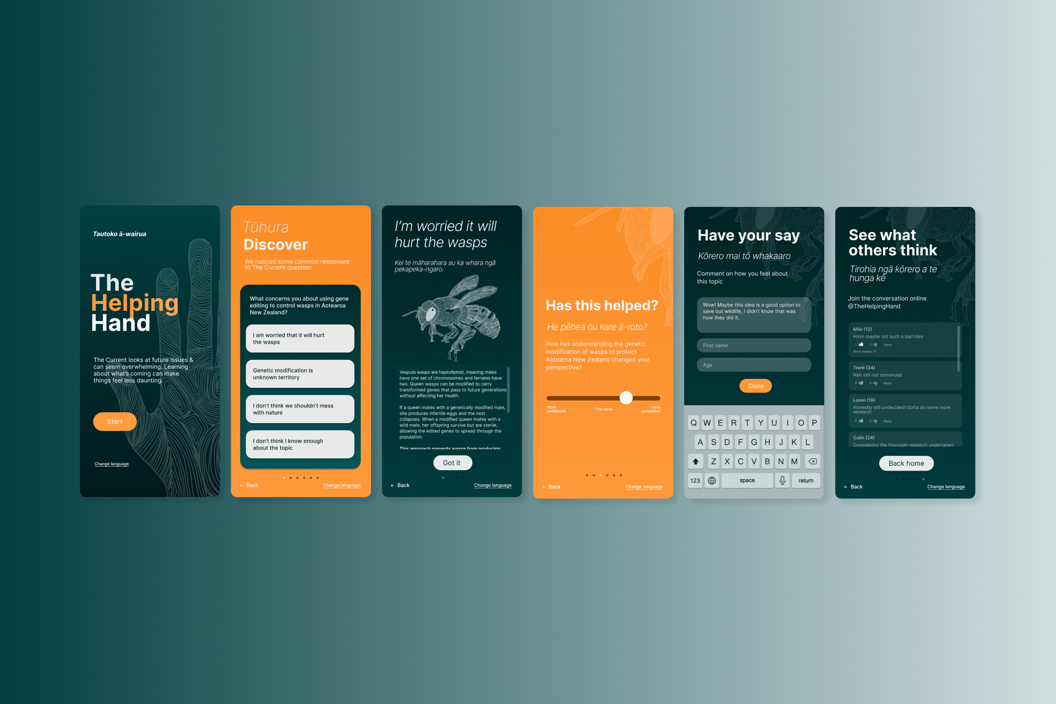
I began by analysing live survey data to understand where anxiety and misconceptions were most concentrated. This informed a focused content structure and a supportive, step-by-step flow designed to meet visitors where they were emotionally.
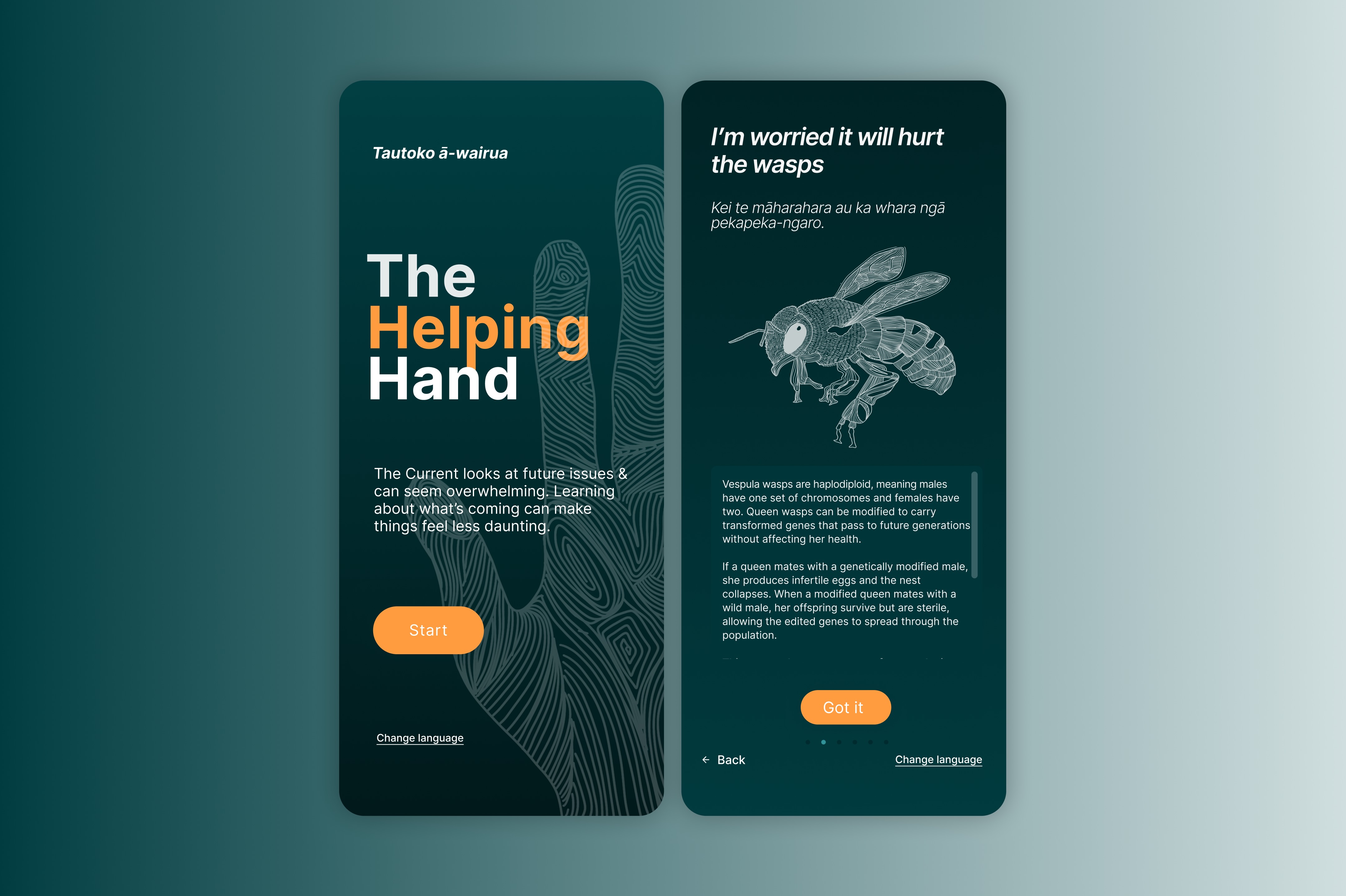
The experience guides users through identifying their concerns, learning through clear and accessible explanations, reflecting on their perspective after gaining context, and finally contributing their own thoughts. Wireframes and high-fidelity designs were developed in Figma, with interaction patterns and pacing designed to feel calm, intuitive, and non-confrontational.
Design principles
Clarity over persuasion.
Calm pacing over information density.
Education that supports reflection, not instruction.
Collaboration and handover
Design decisions were refined through usability testing, with a focus on language, accessibility, and emotional tone. The final output included a fully interactive prototype demonstrating the complete experience and interaction flow.
Outcome
The Helping Hand reframed complex and often polarising topics into an experience that felt supportive rather than overwhelming. By pairing data with clear explanations and reflection points, the installation helped visitors move from uncertainty toward understanding, without forcing a point of view.
“It made me feel a lot less overwhelmed. I didn’t realise how much context I was missing.”
Services delivered
UX research and data analysis
Information architecture
Interaction and experience design
Wireframing and high-fidelity UI
Custom illustration direction
Usability testing
Interactive prototyping
Tools
Figma for design, prototyping, and interaction flows
Data analysis of live survey responses in excel and PowerBI